

Drawing Tablet Pressure Sensitivity: 4096 vs 8192
When you're shopping for a drawing tablet, you'll see numbers like 4096 and 8192 thrown around constantly. Marketing materials treat them like the most important spec on the page. But what does drawing tablet pressure sensitivity actually mean for your artwork — and does a higher number always mean better results?
pressure sensitivity levels affect how naturally your strokes vary in width and opacity as you draw. The more levels your tablet supports, the finer the gradations it can detect. Beyond a certain point, the difference becomes imperceptible to most artists — but getting to that threshold matters a lot for specific art styles and techniques. This guide cuts through the spec sheet noise and tells you exactly what you need based on how you actually draw.
What Is Pressure Sensitivity?
Pressure sensitivity is your drawing tablet's ability to detect how hard you press the stylus against the surface. The number — 4096 or 8192 — refers to how many distinct pressure levels the pen can register between a feather-light touch and pressing down firmly.
Think of it like a volume dial. A dial with 4,096 steps gives you very fine control. A dial with 8,192 steps gives you even finer control. Whether you can actually hear the difference depends on your ears — and whether you can feel the difference depends on your art style.
In practice, pressure sensitivity affects three things in your artwork: line width variation (thin at light touch, thick at heavy press), opacity variation (semi-transparent at light touch, fully opaque at heavy press), and texture variation (how soft or hard a brush feels based on how firmly you paint). Your drawing software translates these pressure signals into brush behavior — which is why pressure sensitivity only works when your software and driver are communicating correctly.
It's also worth knowing that raw pressure level numbers don't tell the whole story. Initial Activation Force (IAF) — the minimum pressure needed to register the first mark — matters just as much. A pen with 8192 levels but high IAF can feel stiffer than a well-tuned 4096-level pen with low IAF. This is why experienced artists often talk about "pen feel" rather than just citing the spec number.
4096 vs 8192 Pressure Levels: The Real Difference
Here's a quick summary before we go deeper:
| Feature | 4096 Levels | 8192 Levels |
|---|---|---|
| Stroke variation | Smooth, natural | Even smoother transitions |
| Best for | Beginners, flat color work | Detailed illustration, painting |
| Price range | Budget to mid-range | Mid-range to professional |
| Noticeable difference? | Not for most beginners | Yes, for advanced brushwork |
| UGEE examples | UGEE S640 | UGEE U1680 |
The honest truth: most digital artists — especially beginners — will not notice a practical difference between 4096 and 8192 in everyday drawing. Both deliver smooth, natural strokes in Clip Studio Paint, Photoshop, or Krita.
Where 8192 levels start to matter:
- Watercolor and wet media brushes: More levels mean subtler opacity shifts at the lightest touch
- Fine line variation: Calligraphy-style strokes with extreme light-to-heavy transitions benefit noticeably
- High-resolution print work: When painting at 4K+ canvas sizes with textured brushes
How Much Pressure Sensitivity Do You Actually Need?
For Illustration and Character Art
4096 levels is sufficient for most character illustration work. Clean line art, cel-shading, and flat coloring styles don't demand ultra-fine pressure gradation. If you're drawing in a manga or anime style with consistent line weights, you'll be fine with any modern tablet.
If you're creating detailed portraits with soft skin textures and subtle shading, stepping up to 8192 levels will give you a more natural feel with soft brushes.
For Manga and Line Art
Manga artists actually benefit more from IAF (Initial Activation Force) — the minimum pressure required to register a mark — than from raw pressure levels. A pen that activates at extremely light pressure gives you more expressive, flowing lines.
For manga work, prioritize: low IAF + 4096 levels minimum. 8192 is a bonus, not a requirement. The UGEE S640 hits this sweet spot well for manga artists at an accessible price.
For Watercolor and Texture Effects
This is where 8192 levels genuinely earn their keep. Simulating real watercolor means controlling opacity and wetness at the absolute lightest touch. More pressure levels give you a wider range of that ultra-light zone.
If watercolor or oil painting simulation is your primary work, choose a tablet with 8192 levels and a soft, textured surface feel.
For Beginners
Start with 4096. You'll spend the first several months learning software, building muscle memory, and developing your style. Pressure sensitivity nuances become meaningful only after you've built foundational control. The best drawing tablets for beginners all offer 4096 levels or better.
Tilt Support: Why It Matters Alongside Pressure
Pressure sensitivity tells the pen how hard you're pressing. Tilt support tells it which angle the pen is at — usually measured in degrees (±60° is standard on modern tablets).
Tilt affects brush shape in software that supports it. A round brush tilted at 45° will render as an oval, mimicking how a real pencil or brush behaves when angled. For sketching with pencil-like textures, tilt support adds a layer of realism that pressure sensitivity alone cannot provide.
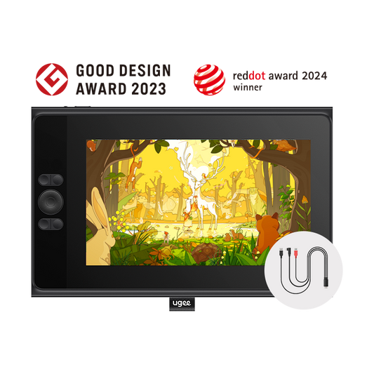
Most tablets at $100+ now include ±60° tilt support. The UGEE UE16 pen display supports both 8192 pressure levels and ±60° tilt — which matters if you use natural media brushes heavily.
How to Test Your Drawing Tablet's Pressure Sensitivity
Once you have your tablet set up, test pressure sensitivity properly:
- Open your drawing software (Clip Studio Paint, Photoshop, Krita)
- Select a tapered brush — a calligraphy or ink brush works best
- Draw a single stroke from very light to very firm pressure in one motion
- Check the taper: does it transition smoothly from hairline to thick? Any visible "steps" indicate lower effective sensitivity
- Adjust the pressure curve in your tablet driver settings if the response feels too heavy or too light
Most artists adjust the pressure curve in driver settings rather than buying a more expensive tablet — a well-tuned 4096-level tablet beats a poorly configured 8192-level one every time.
Pro tip: After adjusting your pressure curve, draw ten strokes ranging from your lightest possible touch to firm press. Look for evenness in the taper at both ends. If the very lightest strokes disappear entirely (no mark at all), your IAF is too high and you should look for a pen replacement or driver update. If heavy strokes feel identical to medium strokes, your pressure curve ceiling is clipped and needs adjusting upward.
Best UGEE Tablets by Pressure Sensitivity Level
| Model | Pressure | Tilt | Screen | Best For |
|---|---|---|---|---|
| UGEE S640 | 8192 | ±60° | No | Beginners, manga, portability |
| UGEE M708 | 8192 | ±60° | No | Students, illustration |
| UGEE U1680 | 8192 | ±60° | 15.8" display | Professional illustration, painting |
All current UGEE tablets ship with 8192 pressure levels as standard — so you get professional-grade sensitivity regardless of which model fits your budget. For animation drawing, the combination of 8192 levels and tilt support makes frame-by-frame work significantly more expressive.
Common Pressure Sensitivity Problems and How to Fix Them
Even with a high-quality tablet, pressure sensitivity can feel off if it's not configured correctly. Here are the most common issues artists run into.
Pressure Feels Too Stiff — Strokes Only Vary at Heavy Pressure
This is the most common complaint from new tablet users. The pen seems to require significant force before strokes change weight, making fine linework impossible.
Fix: Open your tablet driver settings and adjust the pressure curve toward the "light" or "soft" end. This shifts the response so the tablet registers variation earlier in the pressure range. Most artists end up with a curve that's slightly softer than the default.
Pressure Feels Too Sensitive — Strokes Vary Uncontrollably
The opposite problem: even slight hand weight causes strokes to widen dramatically. This makes consistent clean lines very difficult.
Fix: Move the pressure curve toward "firm." This compresses the light-pressure range and gives you more predictable line weight at moderate pressure.
Pressure Works in One App But Not Another
You're getting pressure variation in Krita but nothing in Photoshop — or vice versa.
Fix: Check that the tablet driver is running (look for the icon in your system tray or menu bar). Some software requires you to manually enable tablet input in preferences. In Photoshop: Edit → Preferences → Technology Previews → enable "Use Graphics Processor." In Clip Studio Paint: File → Preferences → Tablet → select your tablet type.
Pressure Suddenly Stops Working Mid-Session
You were drawing fine, then pressure sensitivity disappeared entirely.
Fix: This is almost always a driver issue. Quit your drawing software, close the tablet driver, replug the USB cable or re-pair the wireless connection, restart the driver, then reopen your software. If it happens repeatedly, check for driver updates from the manufacturer.
The Pen Tip Registers a Mark Without Any Pressure
Called "hover detection" or "ghost strokes," this happens when the pen's proximity sensor activates the brush before the tip touches the surface.
Fix: Adjust the Initial Activation Force (IAF) setting if your driver offers it. Alternatively, in your drawing software, set a minimum brush size above zero — this prevents the very lightest touches from creating visible marks.
Choosing Based on Your Setup: A Quick Decision Framework
If you're still unsure which pressure sensitivity level to prioritize, use this checklist:
Choose 4096-level (entry to mid-range) if you:
- Are learning digital art for the first time
- Work primarily in flat colors, cel shading, or clean line art
- Draw manga, comics, or cartoon-style illustration
- Have a budget under $80
Choose 8192-level (mid-range to professional) if you:
- Work extensively with soft brushes, watercolor, or oil paint simulation
- Do detailed portrait work with subtle skin texture shading
- Create work at very high canvas resolutions (4K+)
- Use tilt-sensitive brushes that simulate chalk, pencil, or natural media
The good news: virtually all UGEE tablets now ship with 8192 levels standard, so you're getting professional-grade pressure sensitivity at every price point in the lineup. Whatever your budget, the bottleneck in your digital art journey won't be pressure sensitivity — it'll be practice time, brush settings, and learning your software. Invest in those first, and let the hardware support you quietly in the background.